
Quinky
Product and brand design for a more open conversation about intimacy
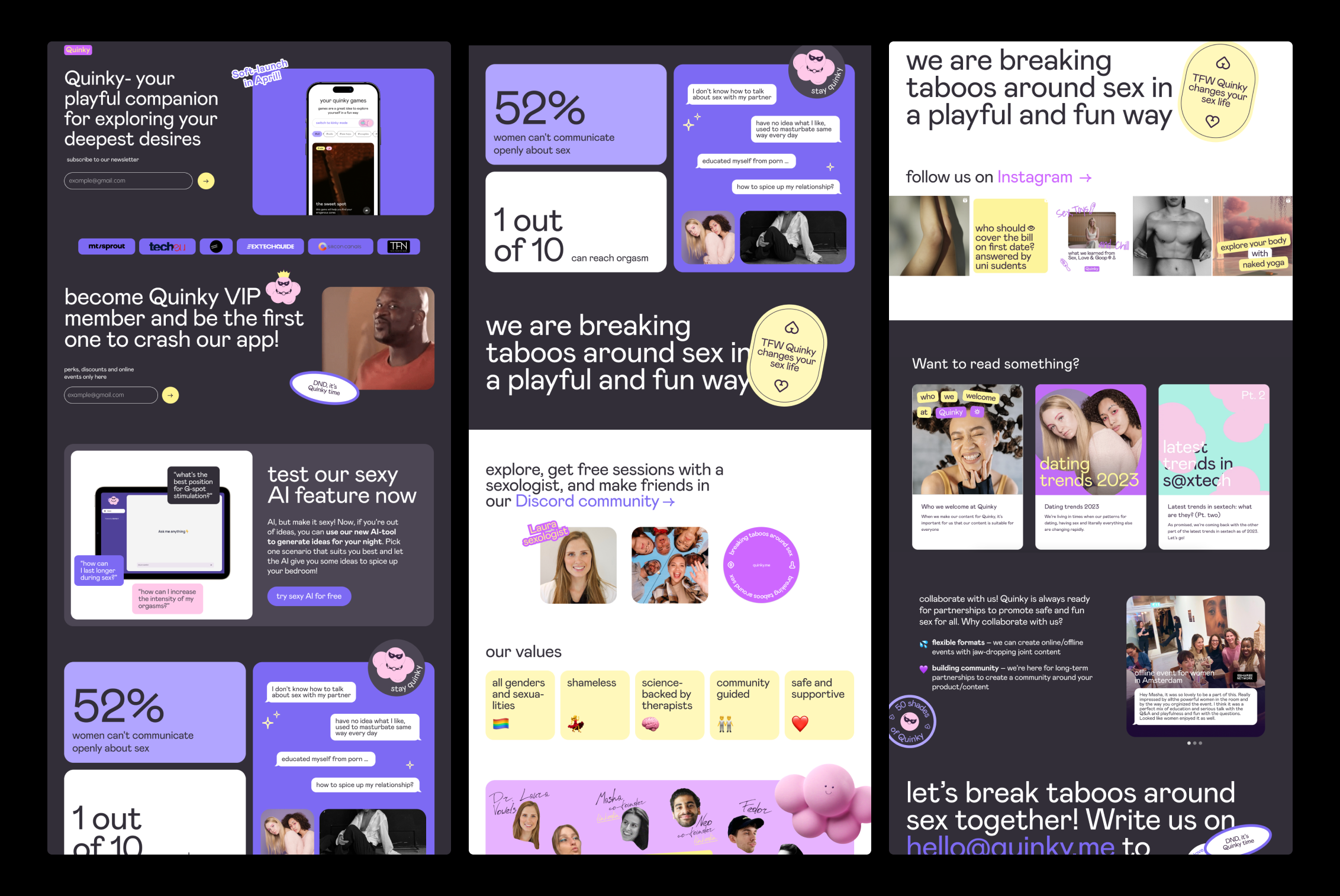
Quinky is a digital wellness product that brings educational, playful and community-led content about intimacy and relationships into one mobile experience.
OSAM created the UX/UI, visual identity and motion language as one connected system. The goal was to make personal topics feel open and approachable while keeping the interface clear, trustworthy and easy to navigate.
The challenge: building trust without losing personality
Designing an intimate wellness app means balancing emotional sensitivity with an experience people actually want to explore. Quinky needed to communicate openly about relationships and intimacy without feeling clinical, intimidating or overly provocative. The product also had to make different types of content feel connected, from educational guidance and playful activities to community stories and events.
Our challenge was to create a mobile app UX/UI design that could guide first-time users clearly while leaving room for curiosity. Privacy, tone of voice, content hierarchy and visual feedback were considered together. This gave Quinky a trustworthy product foundation and a distinctive brand experience rather than a collection of unrelated screens.
Playful by nature, clear by design
Sensitive subjects need a careful product experience. The interface uses direct language, friendly shapes and a vivid colour system to lower the barrier to discovery without making the content feel clinical or distant.
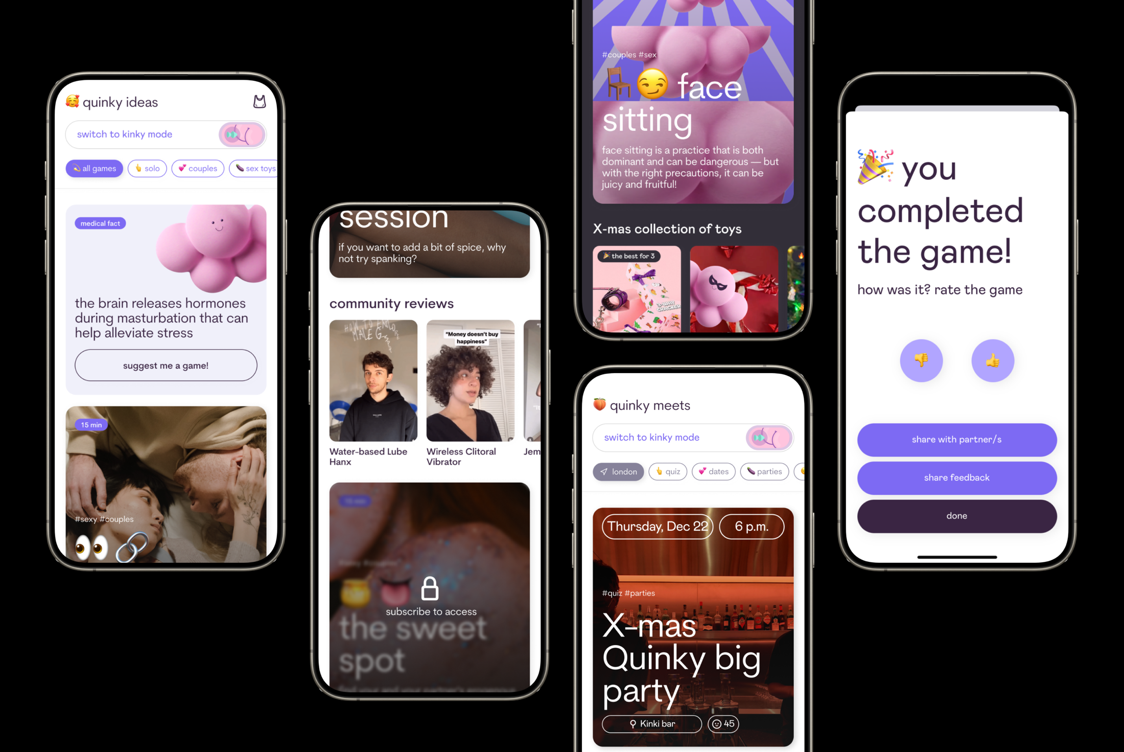
Navigation and repeatable card patterns connect guided activities, ideas, educational content, community stories and events. New material can be added without losing the product’s visual logic.
The UX system uses familiar interaction patterns, clear content categories and consistent calls to action. Each screen gives users enough context to decide what to do next, while modular components help the product team extend the experience across new topics and formats.
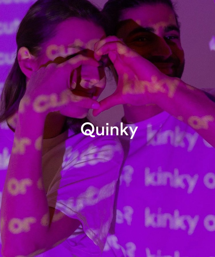
A visual language built to feel open, playful and human.
Where the brand meets the product
Quinky needed more than a logo treatment. The identity had to work across onboarding, content cards, games, completion states, the website and social campaigns.
Typography, colour, photography, the Quinky character and motion behaviours were developed as flexible ingredients. Together they create a recognisable experience across every digital touchpoint.
Motion that explains the experience
Animated interface examples demonstrate how the product works, while character motion adds personality to presentations and launch content. Movement supports understanding first and keeps the tone unmistakably Quinky.
One design system across product, brand and campaigns
The final direction connects mobile app design, visual identity, website design and motion into one flexible system. Shared typography, colours, shapes and image treatments make every touchpoint recognisable, whether someone discovers Quinky through a campaign, visits the website or returns to the app.
For the product team, this creates a practical foundation for growth: new content can be designed faster, campaigns can stay consistent and the interface can evolve without losing the personality of the brand. The result demonstrates how a focused product design studio can turn strategy, UX/UI and identity into a coherent digital experience.
Explore OSAM’s approach to digital product design or start a conversation about your own app.
What OSAM designed
Product thinking and brand expression were developed together, so every screen and campaign could feel part of the same digital product.
- Product UX
- Mobile app UI
- Visual identity
- Design system
- Motion design
- Website design
- Social media design
- Campaign assets