TCG Card Scanner
TCG Card Scanner was already working, and working well. Built with AI-assisted tools, it had the features collectors needed. What it didn’t have was an interface people enjoyed: users called it hard to navigate and visually outdated.
The client asked us for two things: redesign the app and give it ASO screenshots strong enough to fuel growth.
Our competitor research showed a familiar picture. Like much of its category, the app carried the typical marks of rapidly built products: everything technically there, nothing clearly in charge.
So we redesigned the entire app, simplified the core journeys and rebuilt the card scanner around what collectors actually do: identify, value, save. We also designed a brand-new authenticity check, and created new ASO screenshots and promo videos for the App Store and marketing campaigns.
- UX audit
- competitor research
- product strategy
- product redesign
- UX/UI design
- card scanner UX
- design system
- ASO screenshots
- promotional videos
UX/UI redesign for a faster trading card scanner and collection app
- Type
- Product
Mobile app - Services
- UX audit
Product redesign - Industry
- Collectibles
Trading cards - Platform
- Mobile
TCG Card Scanner helps collectors identify trading and sports cards, follow market prices and know what their collection is really worth.
We redesigned the core experience so scanning feels faster, collection data reads clearer and everyday navigation stops being a puzzle, for first-time and seasoned collectors alike.
The challenge: turning card data into decisions
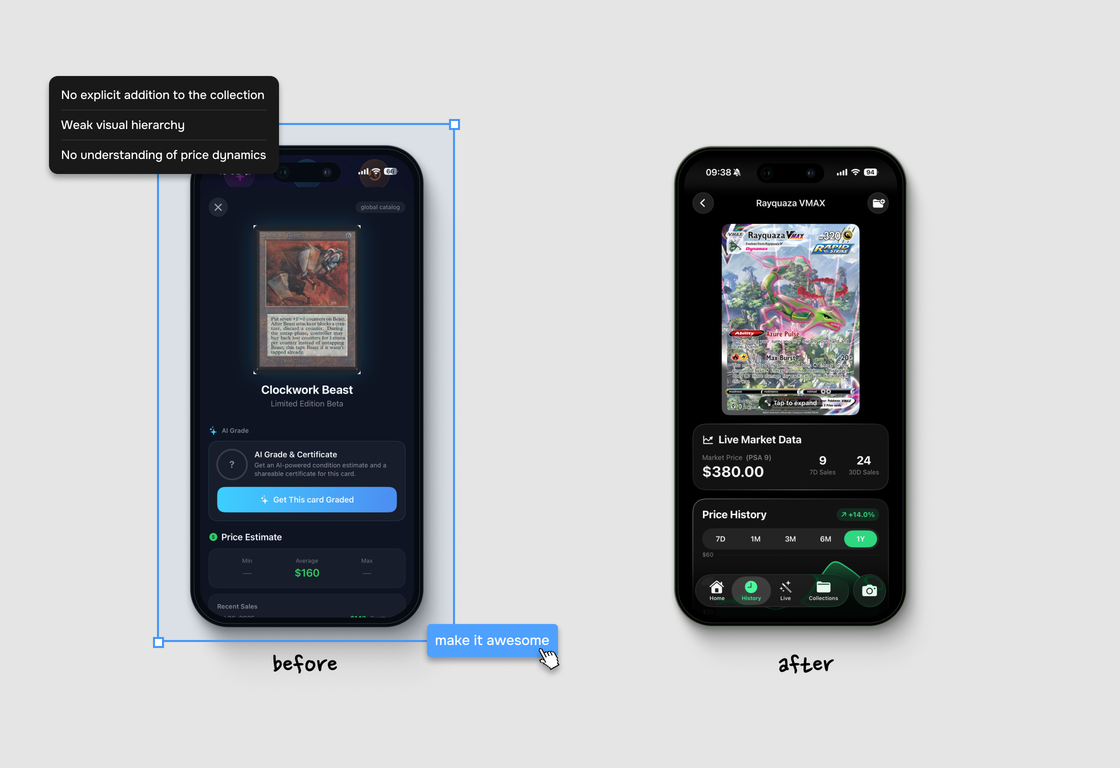
The original app was powerful, but every feature shouted at once. Scanning, grading, market prices, history and collections all competed for the same spotlight, and users were left guessing what to do next.
We audited the existing flows and rebuilt the product around the collector’s four real goals: scan a card, confirm it, check its value, save it to the right collection.
A focused scanning and valuation experience
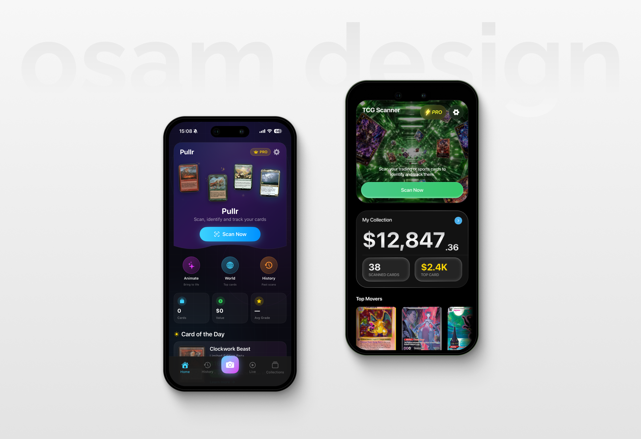
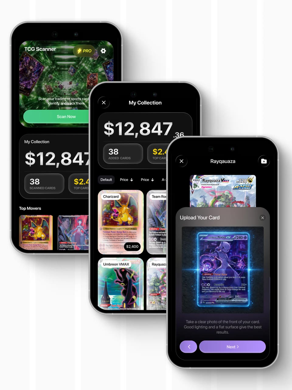
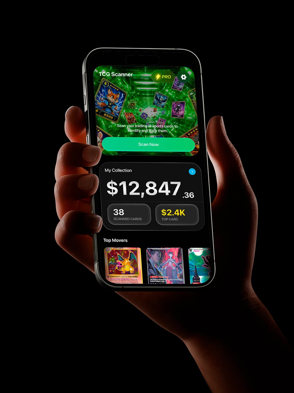
The new home screen has one unmistakable job: scan. Collection value and market movement stay visible, so users act fast without losing the money side of the story.
Card detail screens bring identity, live market data and price history together in one compact layout. Strong contrast and consistent components keep a data-heavy dark interface easy to read.
Collection management built around real value
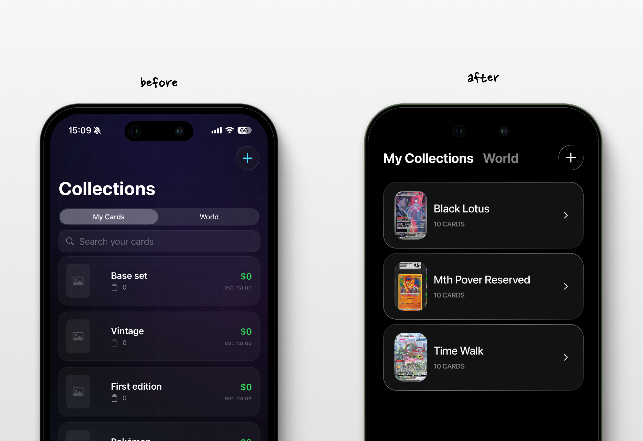
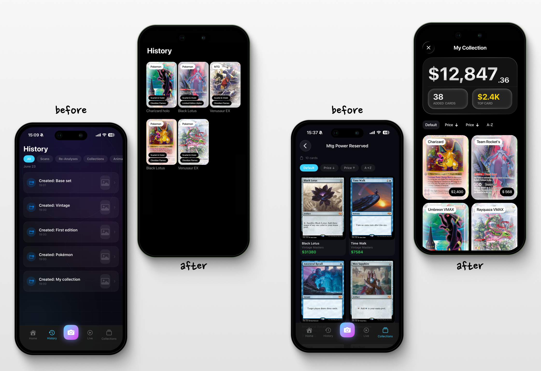
Before opening the full catalogue, collections now show what matters at a glance: total value, number of cards and the most valuable one. Simpler filters and bigger card previews make comparing cards feel like browsing a binder, not reading a spreadsheet.
A new design system ties it all together, from scanning and history to card details and collections.
A new feature: authenticity checks
Beyond the redesign, we came up with something the category was missing. Collectors can now verify that a card is genuine and get a certificate of originality.
In a market full of convincing fakes, knowing what you own matters as much as knowing what it’s worth. Because “looks legit to me” is not a grading system 🔍
Scan faster. See the value. Keep every collection in order.
What OSAM redesigned
A clearer trading card companion that connects scanning, market data and collection management.
Does your app work great but look like it was built in a hurry?
Your app could look this OSAM. Let’s redesign it ✨
Start a project with OSAM