[01/11] Master Swiper
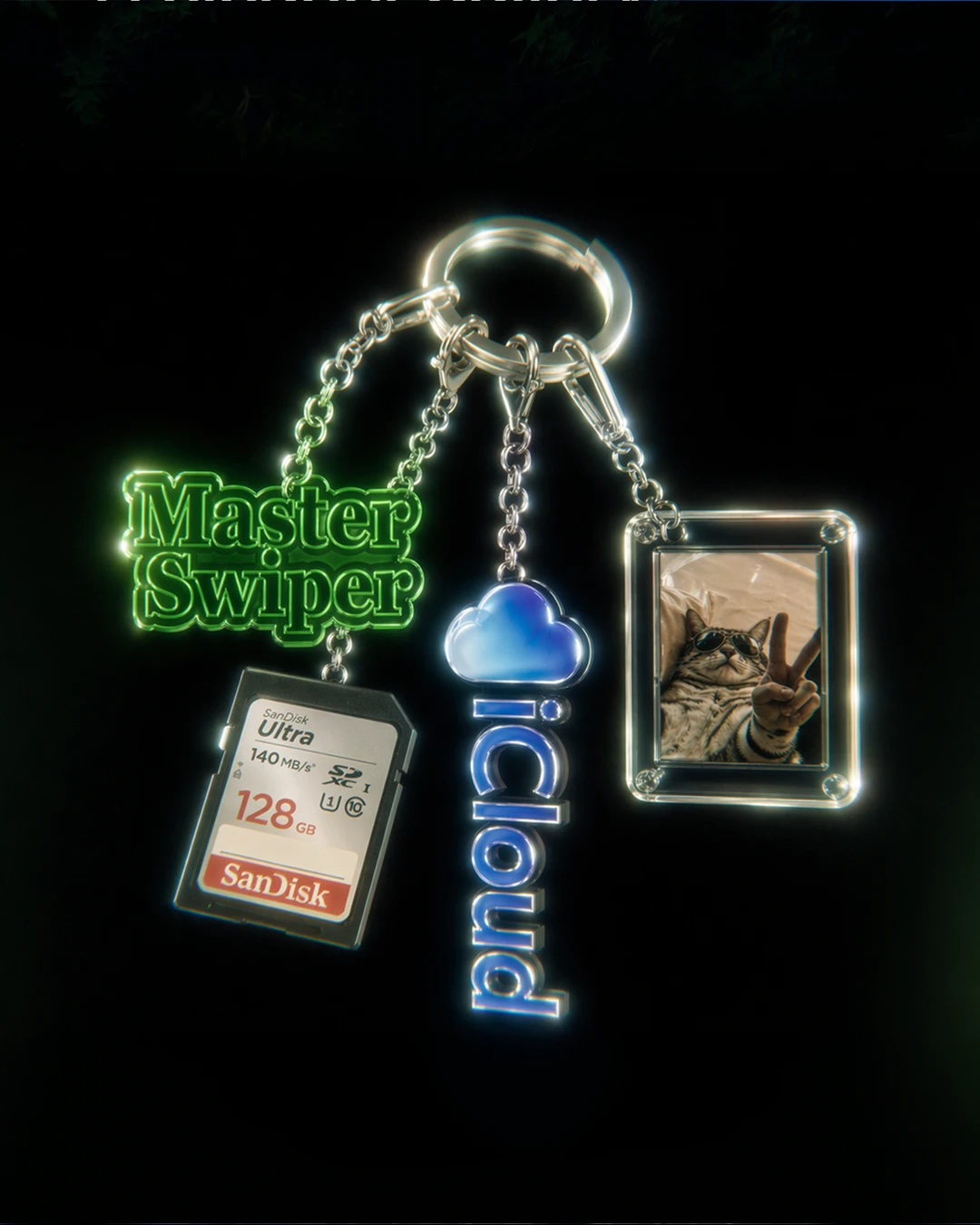
Apple kept saying no. Master Swiper, a cleaner app for iPhone, was rejected from the App Store for design spam, and the client came to us to find out why.
Our research gave a clear answer: the app looked like thousands of other cleaners already in the App Store. Same clunky flows, different icons. A new colour palette wasn’t going to fix that 👀
So we rethought the design instead of giving the same screens a fresh coat of paint. New visual direction, its own personality, and details we actually thought through. The result passed Apple’s review on the first submission after our redesign.
- UX research
- Competitor analysis
- User flows
- Mobile UX/UI
- Visual redesign
- Interaction patterns
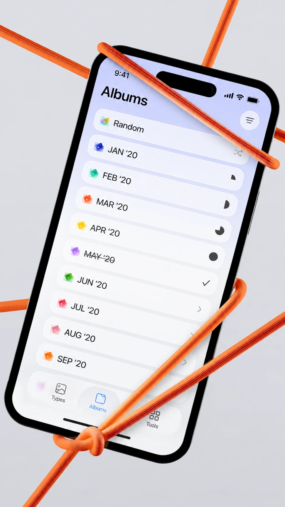
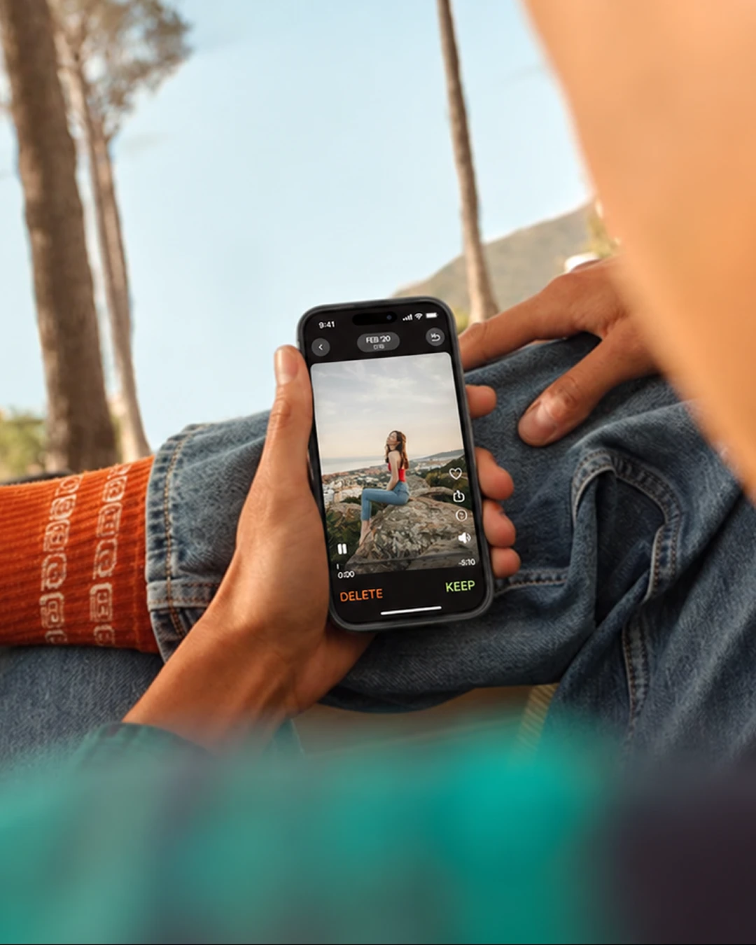
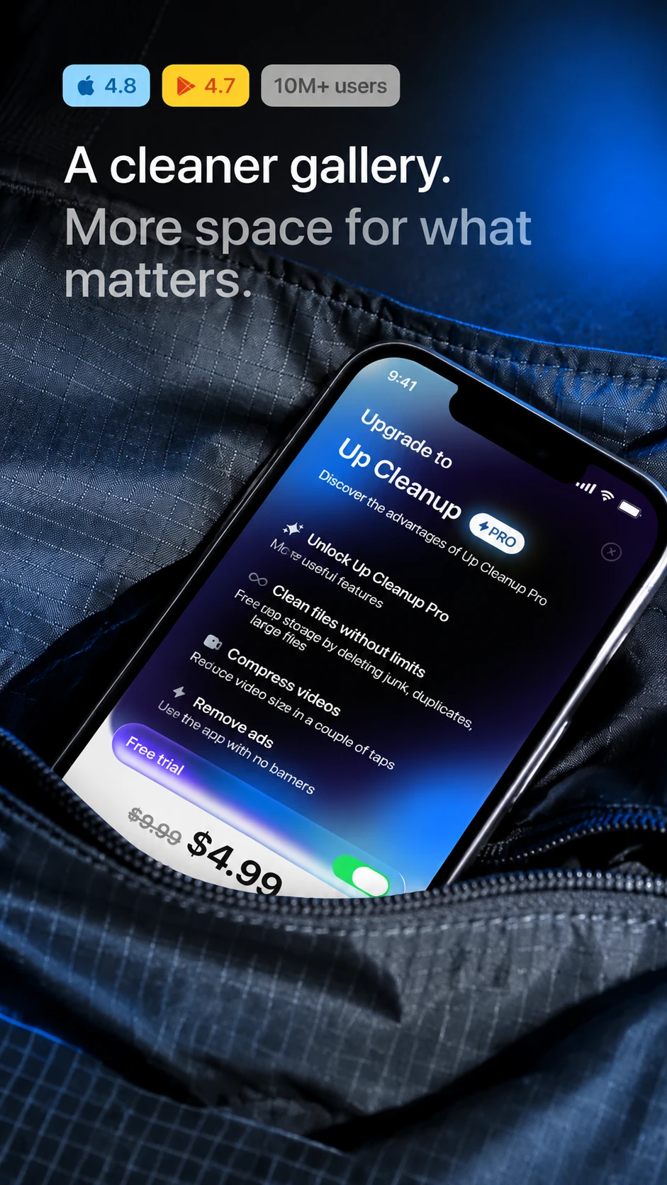
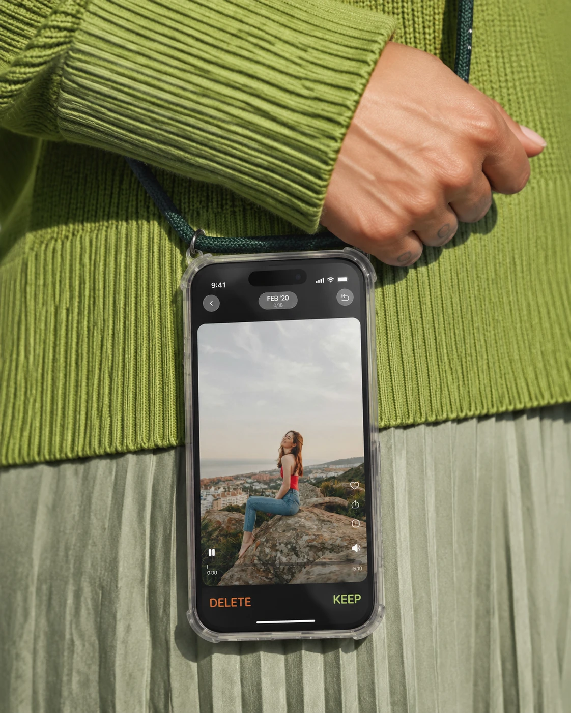
App UX/UI redesign for a photo cleaner that stands out
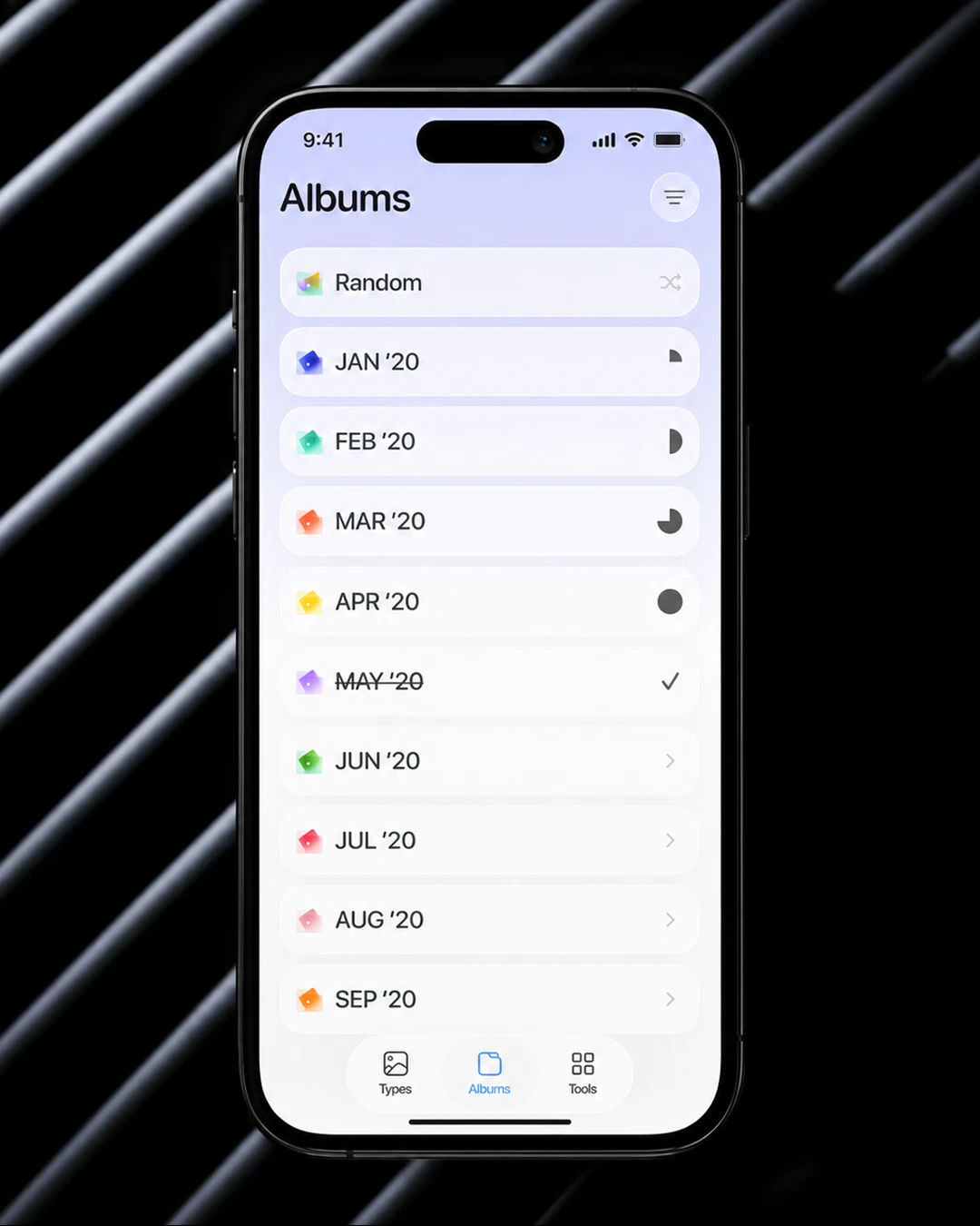
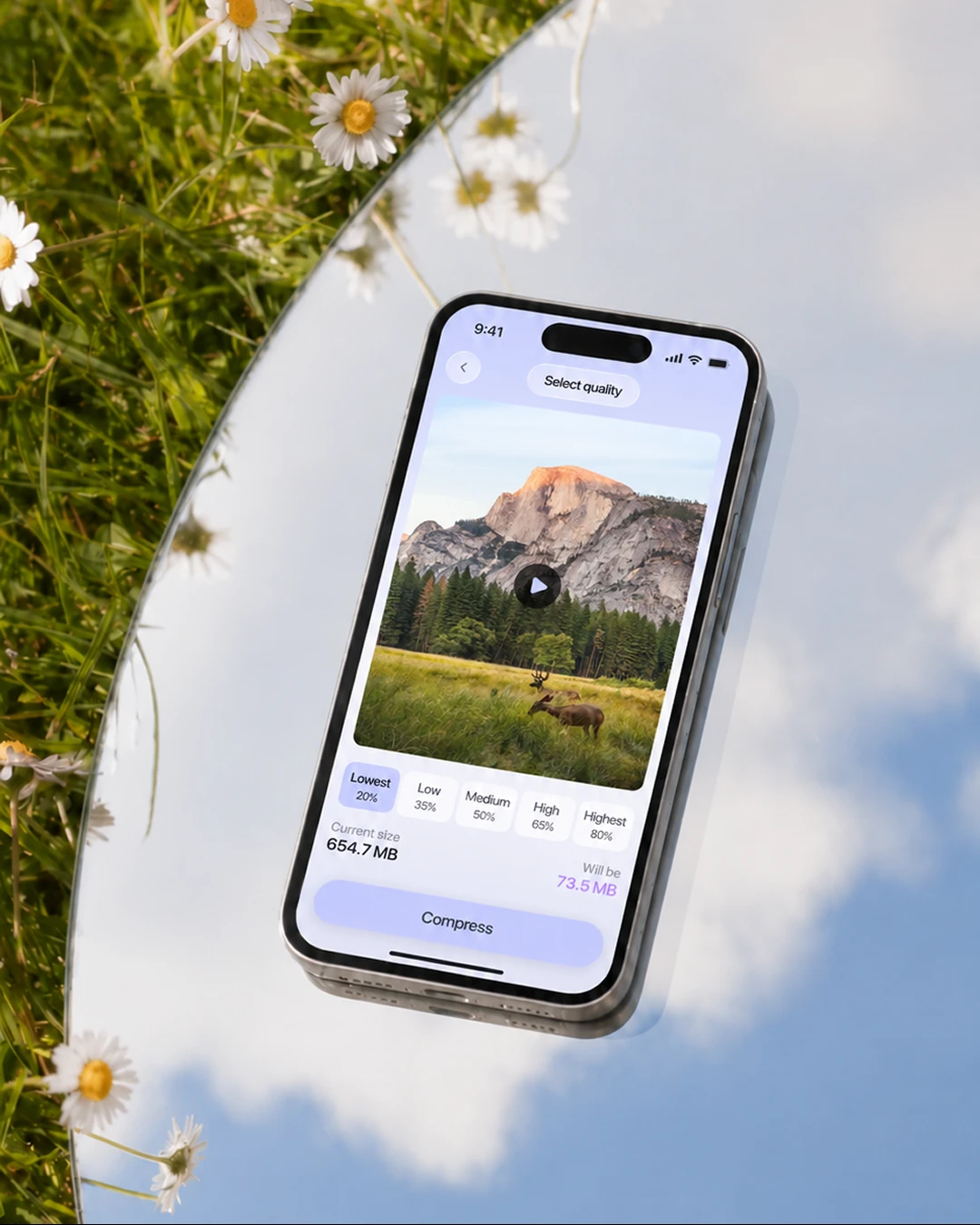
Master Swiper helps people free up storage and protect their privacy on iPhone: clean up similar photos, screenshots and duplicates, compress heavy videos and hide private content.
The challenge: standing out in a category of look-alikes
Cleaner apps tend to copy each other screen by screen. For Apple, that sameness was the problem. For users, the bigger problem was that deleting photos often felt harder than taking them.
We set out to solve both with one simple idea: make the chore feel less like a chore.
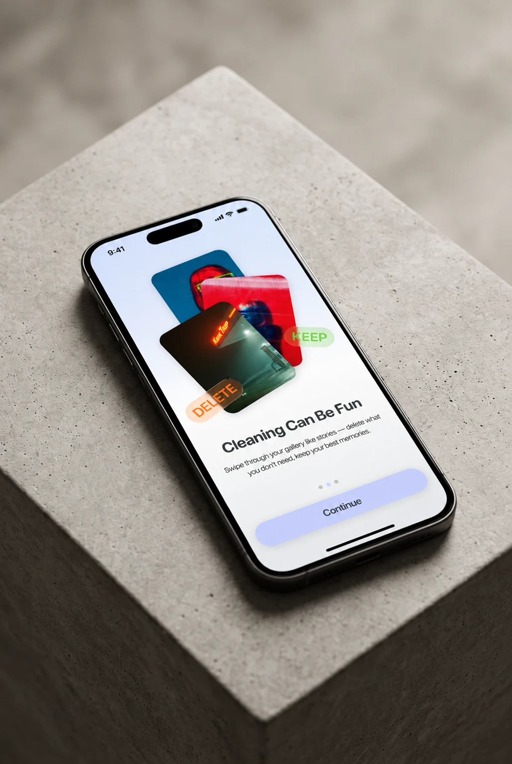
Swipe to keep. Swipe to delete
We built the core experience around a gesture everyone already knows. Swipe one way to keep a photo, the other way to delete it. Tinder rules, no bad dates 😉
500 sunset photos from one evening? Now it takes a few minutes to decide which three are worth keeping 🌅
Its own look, not another template
Instead of borrowing the category’s usual visual language, we gave Master Swiper a distinct direction and personality, so it reads as its own product at first glance, both to users and to App Store review.
What OSAM redesigned
Got an app that needs a rethink, not a repaint?
Make it OSAM. Let’s redesign it ✨
Start a project with OSAM